Part 4: Buying and governance · Chapter 15
Measuring outcomes honestly
How to measure whether safety technology works: leading vs lagging indicators, baselines, denominators, attribution, regression to the mean and honest reporting.
By LIPAI WANG · Updated · 16 min read · 10 sources · 1 figure
Measuring whether safety technology works means combining leading indicators that show whether conditions and behaviors are changing with lagging indicators that show whether harm is falling, each expressed as a rate over a clear denominator and compared with a measured baseline. The hard parts are attribution (other things change at the same time), small numbers (injuries are rare, so counts swing by chance) and regression to the mean (sites picked after a bad period tend to improve anyway). An honest report states its baseline, denominators, comparison, uncertainty and limitations, and does not present a vendor's detection counts as proof of fewer injuries.
This chapter is written for EHS managers who have to report results to a leadership team, a board, a works council or an insurer, and for anyone reading a vendor case study and wondering how much to believe.
Why is measuring safety outcomes so hard?
Three features of safety data cause most of the trouble.
Serious events are rare. A site of 300 people might have a handful of recordable injuries a year and, with luck, no serious ones. Rare events produce noisy counts, so year-to-year changes are often chance.
Reporting is part of the measurement. The number of recorded near misses or minor injuries depends on how willing people are to report them, how easy reporting is and whether reporting leads to blame. A safety program can change reporting behavior as much as it changes risk.
Many things change at once. A site that installs cameras may also re-stripe walkways, hire a new safety manager, change shift patterns, add volume for peak season and run a safety campaign. Each of these affects the numbers.
Technology adds a fourth problem: the system that is supposed to reduce unsafe events is often also the system that counts them. If the counting changes, the results change, whether or not the risk did.
What is the difference between leading and lagging indicators?
OSHA defines leading indicators as "proactive and preventive measures" that show how well safety activities are working and reveal potential problems, and lagging indicators as measures of events that have already happened, "such as the number or rate of injuries, illnesses, and fatalities" [1]. OSHA's guidance puts the relationship simply: a good program "uses leading indicators to drive change and lagging indicators to measure effectiveness" [1]. HSE's guidance on managing for health and safety uses a Plan, Do, Check, Act cycle in which checking performance is a core step [7], and ISO 45001 requires organizations to monitor, measure, analyze and evaluate their health and safety performance [9].
| Type | Examples | Strengths | Weaknesses |
|---|---|---|---|
| Lagging | Recordable injuries, lost-time injuries, DART cases, fatalities, workers' compensation claims, property damage | Measure what ultimately matters; widely understood; comparable across organizations | Rare and noisy; arrive too late to steer; sensitive to reporting culture and claims management |
| Leading (activity) | Inspections completed, training completed, hazard reports submitted, corrective actions closed on time | Easy to collect; show whether the program is running | Measure effort, not effect; easy to game |
| Leading (condition or behavior) | Observed pedestrian entries into vehicle zones, blocked exits, forklift speed exceedances, PPE compliance from structured observation | Closer to actual risk; frequent enough to show change | Need consistent definitions and measurement; technology-measured versions depend on the system |
| Technology-generated | Detected events per camera-hour, alerts per shift, time from alert to action | Continuous, high volume, objective once defined | Change when models, thresholds or coverage change; can be influenced by behavior near cameras |
Choosing leading indicators
OSHA's 2019 guide "Using Leading Indicators to Improve Safety and Health Outcomes" (OSHA 3970) says good leading indicators follow SMART principles, which it defines as specific, measurable, accountable, reasonable and timely [10]. For a technology deployment, good leading indicators are linked to the hazard you bought the system to address, measured in the same way before and after, and partly measurable without the technology itself.
For example, if the purpose of an AI video system is to reduce vehicle and pedestrian conflicts in a yard, a sensible set might be:
- Pedestrian entries into marked vehicle zones per 1,000 vehicle movements, from the system and from monthly structured observations.
- Close-proximity events (person within a set distance of a moving vehicle) per 100 camera-hours.
- Median time from a high-severity alert to a supervisor's acknowledgment.
- Number of engineering or layout changes made because of the data, and whether the event rate in those spots fell afterwards.
- Vehicle and pedestrian near misses reported by people, tracked separately from system detections.
Avoid indicators that reward silence. A target to reduce reported near misses, or a bonus tied to recordable injury counts, creates pressure not to report. In the US, OSHA's recordkeeping rule requires a reporting procedure that does not deter or discourage employees from reporting and prohibits discriminating against an employee for reporting a work-related injury or illness [4].
How do you set a baseline?
A baseline is the measurement you compare against. Most claims of improvement fail because the baseline is missing, too short or measured differently from the follow-up.
Use the same definitions
If the "after" figure comes from AI detections and the "before" figure comes from a supervisor's impressions, the comparison is meaningless. Options that keep definitions constant:
- Run the system in silent mode before alerts go live (Chapter 14), so you have detections measured in the same way before and after.
- Run structured observations with the same checklist, observers and times of day before and after.
- For injuries, use the same recordability rules and the same data source throughout.
Make it long enough
Injury baselines should usually cover at least one to three years of history, and longer for serious events. Leading-indicator baselines need enough weeks to capture normal variation across shifts, days of the week and volume. If your operation is seasonal, a baseline taken in a quiet month and compared with a peak month will mislead in either direction.
Freeze the configuration, or record every change
Technology-generated indicators drift when the system changes. Keep a change log of camera additions, removals and moves, zone redrawing, threshold changes and model updates. When a change affects the metric, mark it on the chart and, where possible, re-baseline.
Why do denominators matter so much?
A count without a denominator cannot be compared. If headcount, hours, volume or coverage change, counts change with them.
Injury rates
The standard US measure is the incidence rate per 100 full-time equivalent workers:
Incidence rate = (number of recordable cases × 200,000) ÷ total hours worked by all employees
The 200,000 figure represents 100 workers working 40 hours a week for 50 weeks. BLS provides a calculator that applies the same formula and lets you compare a result with industry rates [3]. For context, US private industry recorded 2.3 cases per 100 full-time workers in 2024 [2]. For cases involving days away from work (DAFW), BLS reports an annualized 2023 to 2024 rate of 86.6 per 10,000 full-time workers, with a further 54.2 per 10,000 for cases involving only job transfer or restriction [2]. Note the different bases: per 100 workers for the total rate, per 10,000 for the case-type rates.
Definitions differ between systems, and that matters for comparisons. In Great Britain, 59,219 employee injuries were reported by employers under the RIDDOR regulations in 2024/25, while the Labour Force Survey estimates that 680,000 working people sustained a workplace injury [6]. Both figures are correct; they measure different things with different thresholds and sources. Comparing your site's RIDDOR-reportable rate with a national survey estimate, or an OSHA recordable rate with another country's lost-time rate, produces nonsense.
Exposure denominators for technology metrics
For detected events, choose a denominator that reflects exposure:
| Metric | Weak version | Better version |
|---|---|---|
| Pedestrian zone entries | Count per month | Per 1,000 vehicle movements or per 100 camera-hours |
| PPE non-compliance | Count per month | Share of observed person-tracks without required PPE |
| Speeding events | Count per week | Per 100 vehicle operating hours |
| Close-proximity events | Count per site | Per 100 hours of active vehicle operation in covered zones |
| Alerts | Total alerts | Alerts per camera per shift, split by severity |
A worked example shows why this matters. In a four-week baseline, 12 cameras run continuously for 28 days, giving 8,064 camera-hours, and record 504 pedestrian zone entries: 6.25 per 100 camera-hours. In a later four-week period the count falls to 380, a 25% drop. But three cameras were offline for the whole period after a network change, so coverage was 6,048 camera-hours, and the rate is 6.28 per 100 camera-hours. The rate did not improve, so a headline of "25% fewer unsafe events" would have been false.
Volume matters as much as coverage. A distribution center that handles 30% more pallets in peak season will usually see more vehicle movements and more conflicts. Per-movement rates allow a fair comparison; raw counts do not.
How do small numbers mislead?
Injury counts at a site follow patterns close to what statisticians call a Poisson process: even if underlying risk is constant, the number of events in a period varies by chance. The smaller the count, the larger that variation is relative to the count.
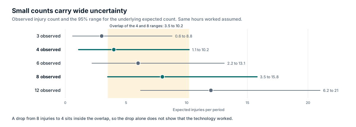
Take a site with the same hours worked in two years. It records 8 recordable injuries in the year before a technology rollout and 4 in the year after. That looks like a 50% reduction. But if the underlying risk had not changed at all, a split of 12 injuries into 4 or fewer in the second year would happen by chance about 19% of the time. The 95% confidence interval around a count of 4 runs from roughly 1.1 to 10.2, and around a count of 8 from roughly 3.5 to 15.8. The intervals overlap heavily.
| Observed count | Approximate 95% confidence interval for the underlying expected count |
|---|---|
| 3 | 0.6 to 8.8 |
| 4 | 1.1 to 10.2 |
| 6 | 2.2 to 13.1 |
| 8 | 3.5 to 15.8 |
| 12 | 6.2 to 21.0 |
The intervals are exact Poisson intervals.
Practical consequences:
- Do not report percentage changes in injuries at a single site over one year as evidence of effect. Report the counts, the hours and the rates, and say that the numbers are too small to separate an effect from chance if that is the case.
- Pool data across sites and longer periods when you can.
- Use statistical process control charts (for example, a u-chart for rates) to show whether a change falls outside the normal range of variation, rather than comparing two single points.
- Put more weight on frequent leading indicators for early evaluation, and use injuries as a longer-term check.
What is regression to the mean, and why does it fool safety programs?
Regression to the mean is "a statistical phenomenon that can make natural variation in repeated data look like real change" [5]. When a measurement is unusually high partly because of chance, the next measurement tends to be closer to the average, with or without any intervention.
Safety programs are especially exposed because interventions are usually triggered by bad results. A site has its worst quarter in years, leadership responds by installing a new system, and the next quarter is better. Some of that improvement would have happened anyway. The same thing happens to individual workers flagged for coaching after an unusually bad week, and to "hot spot" zones chosen because they had the most events last month.
Barnett, van der Pols and Dobson note that the effect is larger when measurements are noisy and when follow-up is limited to subgroups selected for extreme baseline values [5]. Both are typical of safety data. Their main design remedies are control groups and multiple baseline measurements [5]. Translated to safety technology:
- Choose pilot areas on exposure and hazard, not on last period's bad results.
- Use a long baseline with several measurement points, rather than one bad month.
- Include a comparison area that does not receive the technology, and check whether it also improved.
- When you must target the worst area, expect some improvement without any intervention, and only credit the technology with improvement beyond what the comparison shows.
How do you attribute a change to the technology?
Attribution asks: how much of the change would not have happened without the technology? Certainty is rare, but some designs give much better answers than others.
Designs from weakest to strongest
| Design | What it involves | What it can show | Main weaknesses |
|---|---|---|---|
| Before and after at one site | Compare a period before go-live with a period after | That something changed | Cannot separate the technology from regression to the mean, seasonality or other changes |
| Interrupted time series | Many measurement points before and after, analyzing trend and level change at go-live | Whether the change breaks the existing trend | Still vulnerable to other changes at the same time |
| Comparison site or area (difference in differences) | Measure before and after in a treated and a similar untreated area | Change beyond what happened anyway | Areas may differ in ways that matter; contamination if workers move between them |
| Staggered rollout | Introduce the technology to areas or sites at different times, in an order set in advance | Repeated comparisons, each area acting as control until its turn | Needs planning and patience; order should not be chosen on recent results |
| Randomized assignment | Randomly choose which sites or areas receive the technology first | Strongest evidence of cause and effect | Organizationally harder; needs enough sites |
Randomized designs are practical in safety more often than people assume. OSHA's business case page cites a 2012 study in which California's randomly assigned inspections were followed by a 9.4% drop in injury claims and a 26% fall in workers' compensation costs over four years at inspected firms [8]. Random assignment is what makes such figures credible. A multi-site operator rolling out technology over several quarters can often randomize the rollout order at little extra cost.
Record everything else that changed
Keep a dated log of other interventions and changes in the evaluated areas: layout changes, new equipment, staffing and shift changes, training campaigns, leadership changes, volume changes, weather events, changes in reporting systems. Review it when interpreting results, and include the main items in the report.
Watch for observation effects
People often behave differently when they know they are being watched, at least for a while. Early improvements after cameras go live can fade as novelty wears off. Measure for long enough to see whether changes persist, and compare camera-covered areas with uncovered areas nearby to check whether unsafe behavior simply moved out of view.
How can technology-generated metrics mislead?
Detected-event counts are useful, but they are produced by a measurement system that can change independently of risk. Before accepting a fall in detected events as improvement, rule out these explanations:
| Explanation | How it lowers the count | How to check |
|---|---|---|
| Threshold or zone tuning | Fewer events meet the detection rule | Change log; compare periods with identical configuration |
| Model update | New model detects differently | Vendor release notes; re-run old footage if possible |
| Coverage loss | Cameras offline, obstructed or moved | Uptime and camera health logs; per camera-hour rates |
| Displacement | Behavior moves out of camera view | Structured observations in uncovered areas |
| Volume change | Less activity, fewer opportunities | Exposure denominators |
| Alert fatigue | Alerts dismissed without review; events relabeled as false | Review sampling; dismissal rates by reviewer |
| Real behavior change | Fewer unsafe acts and conditions | Independent observation agrees with the system |
The last row is the result you want. The way to show it is agreement between the system and an independent measure, such as structured observations by trained observers using a fixed checklist, ideally including periods and areas the system does not cover.
How do you spot under-reporting?
A safety program that makes reporting feel risky will show improving numbers while risk stays the same. Signs to watch:
- Reported near misses or hazard observations fall sharply after go-live while system detections stay flat or rise.
- Recordable injuries fall but first-aid cases, clinic visits or workers' compensation claims for the same population do not.
- The ratio of lost-time to recordable cases rises, which can mean minor injuries are going unreported while serious ones cannot be hidden.
- Injuries are reported late or reported as non-work-related more often.
- Workers or their representatives raise concerns about discipline linked to the system.
If you see these, investigate reporting culture before you report the trend as a success. In the US, OSHA requires reasonable reporting procedures and prohibits retaliation for reporting [4]; beyond the legal duty, a program that suppresses reports blinds you to the next serious event.
How should results be reported honestly?
What every results report should state
- The question being answered, such as "Did vehicle and pedestrian conflicts in the north yard fall after AI alerts went live?"
- The intervention, including what else was introduced with it (engineering changes, training, new procedures).
- Where and when: sites, areas, dates of baseline and follow-up, and go-live date.
- The measures, with exact definitions and data sources.
- The denominators: hours worked, camera-hours, vehicle movements.
- The baseline, its length and how it was measured.
- The comparison: a comparison area, staggered rollout or trend analysis, or a plain statement that there was none.
- The results as counts and rates for each period, with uncertainty where counts are small.
- Other changes during the period, from the change log.
- Limitations: what the data cannot show, measurement changes, possible reporting effects.
- Costs, including internal time.
- What happens next: scale, extend, adjust or stop.
Language that matches the evidence
| Avoid | Prefer |
|---|---|
| "The system cut injuries by 50%." | "Recordable injuries fell from 8 to 4 with similar hours worked. With numbers this small, the change is within the range expected by chance." |
| "Unsafe behavior down 80%." | "Detected pedestrian zone entries per 1,000 vehicle movements fell from 14.2 to 3.1 between the baseline and months 4 to 6. Structured observations showed a similar direction of change. A comparison yard showed no change." |
| "AI prevented 37 accidents." | "The system raised 37 high-severity alerts that supervisors confirmed and acted on. We cannot know how many would have led to injury." |
| "ROI of 400%." | "Estimated savings depend on assumptions about injury reduction that our data cannot yet confirm. On damage reduction alone, the payback period is estimated at X to Y months." |
(The figures in the second row are illustrative.)
Counting "prevented accidents" is a common and unsupportable claim. An alert that was acted on is a useful output; whether an accident would otherwise have happened is unknowable for any single event.
Separate the vendor's numbers from yours
Vendors calculate metrics in their dashboards using their own definitions. Label them as such in internal reports, check how they are calculated, and reconcile them with your own data. When a vendor wants to publish a case study with your name, review the claims against your analysis, insist on denominators and periods, and decline language your evidence does not support. Throughout this guide, vendor outcome figures are attributed to the vendor because they are rarely independently verified.
Reporting to different audiences
- Leadership and boards need the decision-relevant summary: what changed, how confident you are, what it cost, what you recommend. Show uncertainty plainly instead of hiding it.
- Workers and their representatives need to see what was done with the data: fixes made, how alerts were used, whether any disciplinary use occurred, and what is changing next. This sustains the trust that keeps reporting honest (Chapter 13).
- Insurers and regulators need consistent definitions and a credible method. Overstated claims damage credibility when they are tested.
A measurement plan in one page
| Element | Example for an AI yard-safety deployment |
|---|---|
| Question | Do AI alerts plus follow-up actions reduce vehicle and pedestrian conflicts in the north yard? |
| Primary leading indicator | Pedestrian entries into vehicle zones per 1,000 vehicle movements (system), validated by monthly structured observations |
| Secondary leading indicators | Close-proximity events per 100 camera-hours; median time to acknowledgment of high-severity alerts; corrective actions closed on time |
| Lagging indicators | Vehicle-related injuries and damage incidents per 200,000 hours, tracked over two years with confidence intervals |
| Reporting health check | Reported near misses, first-aid cases, late reports |
| Baseline | Six weeks silent mode; three years of injury and damage history; observations for six weeks before go-live |
| Comparison | South yard, similar layout and volume, receives the system six months later |
| Change log | Owned by site EHS; includes camera, zone, threshold and model changes and all non-technology changes |
| Review cadence | Weekly operational review; quarterly evaluation with control charts; formal report at 6 and 12 months |
| Decision rule | Agreed in advance: scale, adjust or stop based on primary indicator, validation and cost |
Summary
Measuring safety technology honestly means steering with leading indicators and judging with lagging ones, while never assuming that a system's own detection counts prove fewer injuries. Every metric needs a stated denominator, such as hours worked, camera-hours or vehicle movements, because raw counts move with coverage, headcount and volume; the standard US injury rate multiplies cases by 200,000 and divides by hours worked. Baselines must use the same definitions as the follow-up, last long enough to capture normal variation, and be protected by a change log of configuration and site changes. Injury counts at one site are usually too small to show an effect over a year, so report counts, rates and uncertainty rather than percentages. Sites and areas picked after a bad period tend to improve anyway, so use long baselines, comparison areas, staggered or randomized rollouts and an interrupted time series where possible. Check technology metrics against independent observation, watch for falling near-miss reports and other signs of under-reporting, and write reports that state the question, measures, denominators, baseline, comparison, results with uncertainty, other changes, limitations and costs, using language no stronger than the evidence.
Frequently asked questions
+How long before we can say whether AI safety analytics reduced injuries?
At a single site, usually not for a year or more, and often not with confidence at all, because injuries are rare. In the first months, judge the system on leading indicators you can measure reliably, such as changes in observed unsafe conditions, time to corrective action and action closure, and treat injury trends as supporting evidence that needs a longer view and ideally several sites.
+Our vendor reports an 80% reduction in unsafe events. Is that real?
It may reflect real behavior change, but detected-event counts also fall when thresholds are tuned, cameras move or go offline, models are updated, people avoid camera views or alerts are dismissed. Ask how the figure was calculated, over what denominator and baseline, whether it was checked by independent observation, and whether a comparison area showed the same change.
+What is TRIR and how is it calculated?
Total recordable incident rate is the number of OSHA-recordable injuries and illnesses multiplied by 200,000 and divided by total hours worked. The 200,000 represents 100 full-time workers working 40 hours a week for 50 weeks, so the result is cases per 100 full-time equivalent workers per year.
+Should we let a vendor publish a case study about our results?
Only if you agree the content. Check that figures are stated with their denominators and time periods, that vendor-calculated metrics are labeled as such, and that the case study does not claim injury reductions your own analysis does not support. Your name on an inflated claim affects your credibility with regulators, workers and peers.
Related reading
- Buying and pilotingAI safety pilot acceptance criteria: how to define pass and fail
- Measuring outcomesLeading indicators for EHS dashboards: which ones are worth tracking
- Near missesNear-Miss Detection Explained: What AI Video Counts as a Close Call
- Buying and pilotingSafety technology ROI: building an honest business case
- BuyingWhat AI Search Tells Buyers About Safety Vendors, and How to Check It
- BuyingWhat AI Video Safety Vendors Publish for Buyers: A Public Evidence Check
Sources
- [1]OSHA, Leading indicators
- [2]US Bureau of Labor Statistics, Employer-reported workplace injuries and illnesses, 2024 (released January 2026)
- [3]US Bureau of Labor Statistics, Injury and illness incidence rate calculator
- [4]OSHA, 29 CFR 1904.35 Employee involvement
- [5]Barnett AG, van der Pols JC, Dobson AJ. Regression to the mean: what it is and how to deal with it. International Journal of Epidemiology, 2005
- [6]HSE, Key figures for Great Britain 2024 to 2025
- [7]HSE, Managing for health and safety (HSG65)
- [8]OSHA, Business case for safety and health
- [9]ISO 45001:2018 Occupational health and safety management systems
- [10]OSHA, Using Leading Indicators to Improve Safety and Health Outcomes (OSHA 3970, June 2019)
New chapters and updates, once a month
One email when we publish or update guidance. No vendor promotions. Unsubscribe any time.